One page, one job: why every page needs one main action
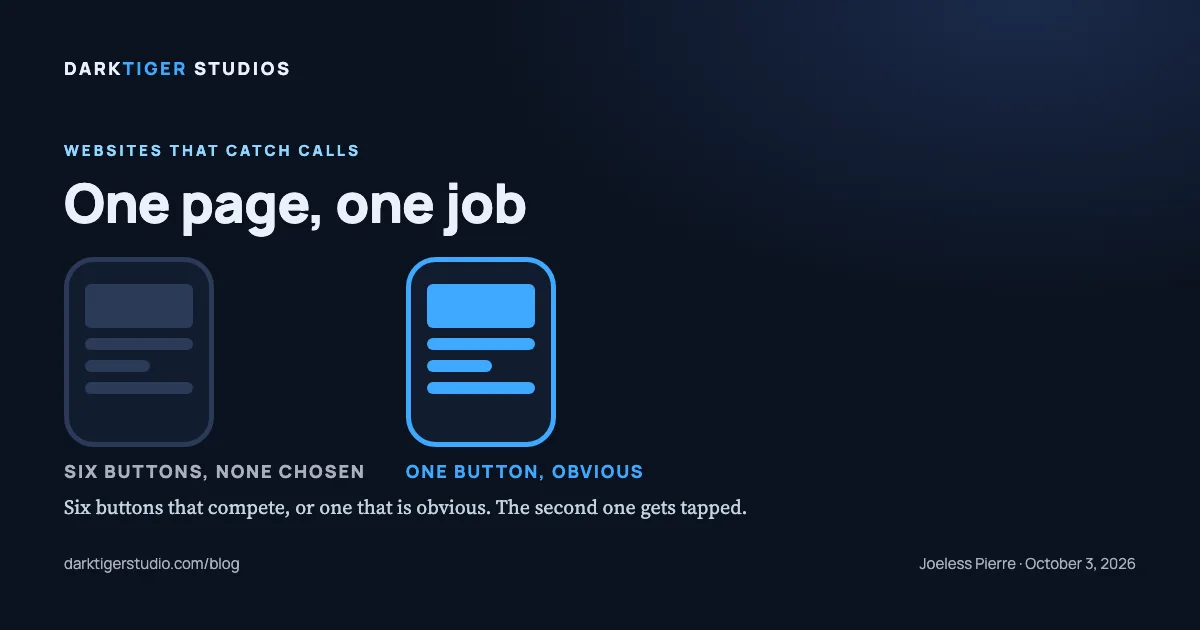
Every page on a contractor website should have one main action, usually "call" or "request service," because a visitor who is handed six choices of equal weight has to stop and think, and a visitor who is handed one obvious choice does not. The second visitor taps. The first one scrolls and weighs.
Where the rule comes from
The clearest statement of it is in Steve Krug's book Don't Make Me Think, Revisited (New Riders, 2014, third edition), the standard introduction to how people actually use web pages (Source: Krug, book page). His second law of usability, in his words: "It doesn't matter how many times I have to click, as long as each click is a mindless, unambiguous choice" (Source: Krug, sample chapter). What costs the visitor is not the click. It is "the amount of thought required and the amount of uncertainty about whether I'm making the right choice" (Source: Krug, sample chapter).
Two of his chapter titles carry the rest of the argument on their own: "Billboard Design 101: Designing for scanning, not reading," and "Omit needless words" (Source: Krug, table of contents). Krug's chapter titles say it: people scan, they do not read.
A page with one main action is a page designed for scanning. A page with "Call," "Get a quote," "Book online," "Learn more," "See our work," and "Chat with us" all the same size is a page that asks the visitor to do the designer's job.
What "one main action" means in practice
It does not mean one button on the whole page. It means one button that is unmistakably the button, and everything else a step down from it.
- The main action is the thing you want most. For an emergency plumber it is the phone call. For a remodeler it is the estimate request. For a landscaper taking spring bookings it is the booking form. Pick one per page.
- The main action is repeated, not multiplied. The same "Call (949) 839-7711" button can sit in the header, under the headline, and at the end of the page. Three copies of one action is still one action.
- The second action is visibly second. On our showroom pages the main button is solid and the alternative is outlined. A visitor who cannot call right now still has a path, and nobody has to choose between equals.
- Every page ends with the next step. A services page that ends in a paragraph has left the visitor at a dead end. Our build gate fails any page whose last section does not hold a form, a button, a phone, email or text link, or a link to the contact or booking point; the legal pages, the 404 page and the confirmation pages are the only exceptions.
The pages that get this wrong most
The home page with a menu as its hero. Six tiles, one per service, each with "Learn more." That is a table of contents, not a page. The main action is missing, and the visitor who wanted to call has to go find the number.
The service page that sells the company. A drain-cleaning page that spends its last third on "About us" and ends with the founding year. The person reading it has a clogged drain. The page should end with the call button.
The contact page with everything on it. Form, phone, email, map, hours, social links, a newsletter box. Pick the one you want them to use and make it first and largest. The rest can stay, smaller.
How to check your own site on a phone
Open your home page. Do not scroll. Ask one question: if I wanted to hire this company right now, what would I tap? If the answer is obvious in two seconds, the page passes. If you find yourself reading to decide, it fails.
Then scroll to the bottom of the page and ask the same question. Then open your most-visited service page and do both again. Three pages, two questions each. It takes four minutes and it is the same test we run.
What to do about it
Rewriting a page to carry one action is mostly subtraction: fewer buttons, one of them solid, the rest demoted, the page ending on the step you want. The words shrink too. "Omit needless words" was Krug's chapter title, and the home page is where most needless words live.
When we build a site, every page is planned around its one action before any layout is drawn, and the copy is approved before the design, so the action is never an afterthought. Sites start at $1,500; the Standard package at $3,500 is the one we recommend for most trades. Details at /build.
Sources
- Steve Krug, Don't Make Me Think, Revisited, sample chapter: Krug's second law; the cost of a click is the thought it takes
- Steve Krug, Don't Make Me Think, Revisited, table of contents: chapter titles on scanning, not reading, and omitting needless words
- Steve Krug, Don't Make Me Think, book page: edition, publisher and year