What should be above the fold on a contractor home page
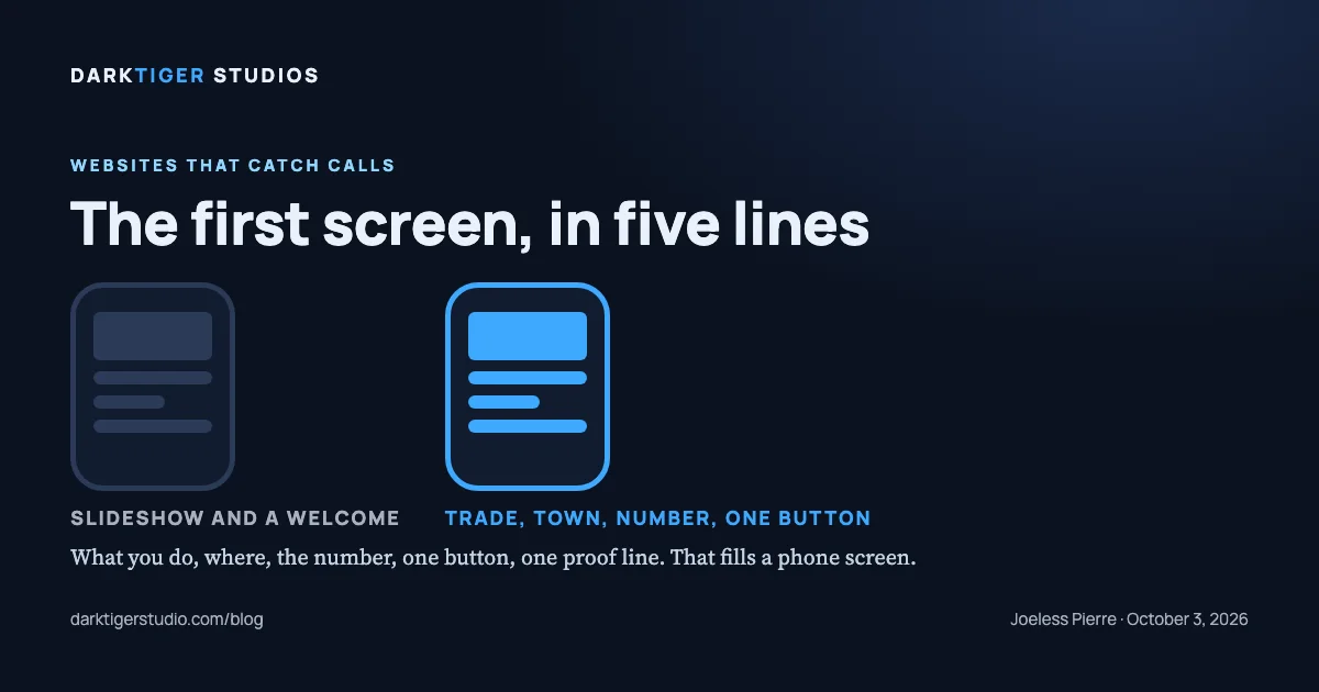
Above the fold on a contractor home page, meaning the first screen a phone shows before anyone scrolls, there should be five things: what you do, where you do it, the phone number as a tap-to-call button, one request button, and one line of proof. On a phone that fills the screen. Everything else, the photos, the services list, the story of the company, can wait for the scroll.
Why so little
Steve Krug's chapter title says it: "Billboard Design 101: Designing for scanning, not reading" (Source: Krug, table of contents). A home page is read the way a billboard is read, at speed, by someone deciding whether to keep going. The first screen has one job, which is to answer "is this the kind of company I was looking for, and how do I reach them?" before the thumb moves.
Krug's other relevant chapter title is "Omit needless words" (Source: Krug, table of contents). A welcome message, a mission statement, a slogan that could belong to any trade: each of those is a word standing between the visitor and the number. His second law puts the cost in plain terms: what costs the visitor is "the amount of thought required and the amount of uncertainty about whether I'm making the right choice" (Source: Krug, sample chapter). A first screen with one obvious button asks for no thought.
The five things, with an example
Here is how our plumbing showroom page is built, line by line, as it stands at darktigerstudio.com/showroom (Source: DarkTiger Studios, showroom). The business is a placeholder; the structure is the point.
- A thin strip at the very top with hours and the number. "Open 7 days, 7 AM to 9 PM. Emergency calls answered around the clock," and the phone. It costs one line and answers the question an emergency caller has first.
- The header: the business name, a Call button, a Request service button. The name links home. Both buttons are in the header on every page, so the first screen of every page carries them, not only the home page.
- The headline: the trade and the promise, in the customer's words. "The plumber who shows up when the water is already on the floor." Not "Welcome to our website." Not "Quality service you can trust." The trade is in the sentence, and so is the moment the customer is in.
- One line of proof, then the trade and the towns. The rating line sits right under the headline, and on a real site it is the real rating with a link to where it lives; on the showroom it is marked as a sample. Under it: "Plumbing and drain service · Your Town, Albany, Colonie, Latham, Troy and Clifton Park." Trade and territory in one line, so a visitor in Troy knows in one glance that they are in range.
- Two buttons, one of them primary. "Request service," solid. "Call (949) 839-7711," outlined, and a tap-to-call link. The visitor who wants to talk now has the number. The visitor who wants to write has the form. Nobody has to choose between equals.
A short paragraph follows, three lines naming the common jobs, and then the first screen is over. Services, how a call goes, reviews, the service area, the form: all below.
What does not belong on the first screen
- A slideshow. The first screen is also the thing Google's lab test times, because its speed metric "reports the render time of the largest image, text block, or video visible in the viewport" (Source: web.dev). A slideshow of five full-width photos puts five large images in the slot where one belongs. We do not build auto-advancing slideshows; that is a studio rule, not a finding, and we state it as such.
- A welcome. The visitor did not come to be greeted.
- Six service tiles with "Learn more." That is a menu, and the menu already exists at the top of the page.
- A full-screen photo with the text below it. On a phone, the photo is the whole first screen and the headline is under the fold. If a photo is on the first screen it shares it with the words, or it sits behind them.
- A pop-up. Anything that covers the first screen is the first screen.
How to check your own site from a phone
Open your home page on your phone and do not scroll. Count what you can see. Then ask four questions: Can I tell what trade this is? Can I tell what towns they cover? Can I press the number and have it dial? Is there one button that obviously starts a job? Four yeses is a pass. Each no is a line that belongs on the first screen and is not there.
Then turn the phone sideways and do it again. Then try it on a tablet if you have one. The first screen changes shape, and the five things should survive each shape.
What to do about it
Rebuilding a first screen is mostly moving things up and taking things out. The headline gets the trade in it. The number becomes a button. The slideshow becomes one photo or no photo. The welcome goes.
When we build a site, the first screen is planned before anything else, the copy is approved before the layout, and every page is checked at seven screen widths from 320 pixels to 1920 before it ships. Sites start at $1,500 for a single page; the Standard package at $3,500 is the one we recommend for most trades. The showroom pages are at darktigerstudio.com/showroom and the packages at /build.
Sources
- Steve Krug, Don't Make Me Think, Revisited, table of contents: chapter titles on scanning, not reading, and omitting needless words
- Steve Krug, Don't Make Me Think, Revisited, sample chapter: the cost of a choice is the thought it requires
- web.dev, Largest Contentful Paint: the largest element on the first screen is what Google's lab test times
- DarkTiger Studios, showroom: the first screen of the studio's showroom home pages, as built